The submissions for this round of the Prix de Print were remarkable for their variety. There were books, installations, DIY constructions, sculptures and animations—each with as strong a claim to be considered “a print” as the eloquent etchings, engravings, woodcuts and monotypes also submitted. Most entries were rich in content and invention, visually dynamic and carefully thought through, which made the job of juror both rewarding and difficult. The difficulty is exacerbated as these works are being judged on the basis of digital reproductions and in the absence of any physical encounter with the artwork itself. Some works required more explanation than others. Curiously, the work selected is one of those whose content is most dependent on three-dimensional material properties—a reminder that some pictures also need a thousand words.
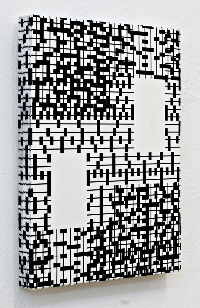
Gesa Puell’s Punkt zu Linie (Point to Line) is, on the surface, a lithograph. Below the surface it is also a lithograph—or rather many lithographs. A wall-work made up of lithographs laminated atop one another in a stack, it occupies the rectangular dimensional block of a painting but articulates that space in a very different way: the printed images on each sheet bleed off the page; the printed images that we see along the sides of piece are not coherent marks but concatenations of ink on the edge of each of the stacked prints.
The chosen work is part of a larger Punkt zu Linie series in which the image (both top and sides) changes from one to the next: one is built from tiny circles packed like sand; another uses big pixellated ovals; another lightweight stretchy circles. In this one, straight lines punctuated by black boxes at regular intervals are used to build patterns that evoke crosswork puzzles, old computer punch-cards, or medieval music notation. All are black and white, and all use the same structure: sheets of stacked paper printed to the edge, whose perimeters join together to produce a new image. Or perhaps it is the other way around: the publisher [artist?] notes, “the image of the front can be logically inferred by tracing the structure of the graphic patterns on the objects’ edges.”
The references suggested by this simple device are rich and contradictory. I love the way the built-up image along the side seems to reference the fore-edge painting in finely bound books, even though the work has nothing to do with antiquarian aesthetics. The fact that it is a stack mounted on the wall suggests a knowing nod toward, and purposeful distance from, the stack pieces of Felix Gonzalez-Torres. The building of the image from bottom to top and down again further suggests a reconstruct of what might be hidden in a woven textile—some kind of three-dimensional weaving, but a weaving that has been blown up.
Born in Venezuela and educated in Scotland, Puell is now based in Munich where she is part of the three-person workshop and print publisher planparallel. In lithographs and site-specific installations she plays with the relationship between flat images and dimensional space. Punkt zu Linie wittily links these concerns to printshop logistics. Printshops are full of stacks of printed paper, all kind of the same and each kind of different. It is easy to treat individual prints as if they were artifacts of Flatland, genuinely two-dimensional, rather than material things with centers, fronts, backs and edges.
Puell makes us look around until the margin becomes the center of attention.